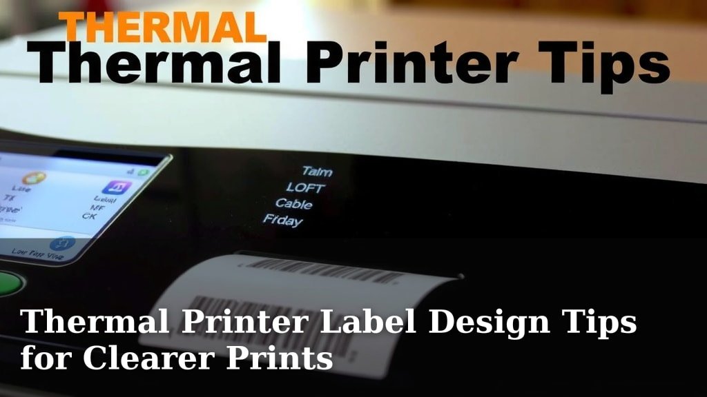
Thermal Printer Label Design Tips for Clearer Prints
Designing thermal printer labels effectively means making them **clear, readable, and professional**. Your labels need to convey information instantly, whether it’s a product price, shipping address, or inventory code. To achieve this, focus on using the right fonts, ensuring good contrast, and keeping the layout clean.
Getting your thermal label design right can save you time and prevent costly errors. A well-designed label reflects positively on your brand. We found that simple, uncluttered designs often perform best for quick scanning and accuracy.
- Keep text large enough to read easily.
- Use high-contrast colors for text and background.
- Don’t overcrowd your label with too much information.
- Choose simple, clear fonts like Arial or Helvetica.
- Test print your design to check readability.
Ready to make your thermal printer labels look their absolute best? Let’s walk through some easy tips to create designs that are both functional and appealing.
You’ve got your thermal printer ready to go. Now, let’s make sure the labels it prints are as effective as they can be. Think of your label as a tiny billboard for your product or information. You want it to be clear, quick to read, and professional.
Designing Your Thermal Printer Labels for Maximum Impact
Making your thermal printer labels work for you is all about thoughtful design. It’s not just about printing words; it’s about communicating information efficiently. We’ve found that a little attention to detail here can save you a lot of headaches later.
Understanding Your Label’s Purpose
Before you even open your design software, ask yourself: What is this label for? Is it for shipping, inventory, pricing, or product identification? The answer will guide every design choice you make. For instance, a shipping label needs a clear address block. An inventory tag might need a barcode and a SKU number.
Shipping Labels: Clarity is King
Shipping labels are all about getting items from point A to point B without a hitch. The most important elements here are the recipient’s address and sender’s information. Make these large and bold. Many shipping services have specific placement requirements for barcodes and tracking information. Always check with your carrier to ensure compliance.
Product Labels: Branding Meets Information
For product labels, you’re balancing branding with necessary product details. Think about product name, price, ingredients, or warnings. You want it to look good on a shelf while still being easy for customers to understand. Consider your brand’s color palette, but remember thermal printers often print in black and white.
Inventory and Barcode Labels: Readability for Efficiency
These labels are for your internal use. The priority is quick scanning and easy identification. A clear, scannable barcode is essential. The accompanying text should be large enough for someone to read at a glance, especially if they are scanning through items quickly.
Font Choices Matter for Thermal Printing
The type of font you choose has a big impact on readability. Thermal printers lay down dots, so very thin or highly decorative fonts can become fuzzy or even unreadable. We’ve learned that simple, sans-serif fonts work best.
Stick to Simple and Clear
Fonts like Arial, Helvetica, and Verdana are excellent choices. They have clean lines and are designed for legibility. Avoid fonts that are too thin, too script-like, or have excessive embellishments. They just don’t translate well to the dot-matrix nature of thermal printing.
Font Size for Scanability
This is another area where bigger is usually better. You don’t want anyone squinting at your labels. For general text, aim for at least an 8-point font. For critical information like names, addresses, or prices, consider 10 or 12 points. Barcode specifications also often dictate minimum sizes.
Color and Contrast: Making Your Text Stand Out
Thermal printers create images using heat, typically producing black marks on white or colored label stock. This means contrast is your best friend. Without it, your text can disappear.
The Power of High Contrast
The classic black text on a white background is a classic for a reason: it offers maximum contrast. If you’re using colored label stock, like yellow or light blue, ensure your text color is dark enough to be easily seen. Dark blue or black text on a light background usually works well.
Avoid Low-Contrast Combinations
Steer clear of combinations like light gray text on a white background, or dark text on a very dark label. These will be difficult to read, especially under poor lighting conditions or for those with visual impairments. We’ve found that what looks good on your computer screen might not print well on a thermal printer.
Layout and White Space: Less is Often More
A cluttered label is a confusing label. Giving your design room to breathe is crucial for readability and professionalism.
Don’t Overload Your Label
Resist the urge to cram every possible piece of information onto one small label. It’s better to have a simple, clear label than one that looks like a complex puzzle. This is especially true for thermal labels where print quality can be limited.
The Magic of White Space
White space, or negative space, is the empty area around text and graphics. It’s not wasted space; it’s essential for guiding the reader’s eye. Ensure there’s adequate margin around the edges of your label and sufficient spacing between different elements. This makes the label look cleaner and much easier to scan.
Essential Elements for Different Label Types
Different labels require different key components. Ensuring these are prominent is vital for their function.
Barcodes: Size, Placement, and Quiet Zones
If your label includes a barcode, check the specifications for the barcode type you are using. For example, the UPC (Universal Product Code) has specific dimensions and formatting rules. Most barcode software will guide you. Crucially, you need a “quiet zone” on either side of the barcode. This is a clear, blank space that scanners need to read the code accurately. Many experts recommend at least 0.1 inches (2.5 mm) on each side (GS1 Standards).
Text Hierarchy: What’s Most Important?
Think about what information needs to grab attention first. Use different font sizes or bolding to create a hierarchy. For a product label, the product name might be largest, followed by the price, then ingredients. For a shipping label, the address is paramount.
Testing Your Thermal Printer Labels
Before you print hundreds or thousands of labels, do a test run. This is perhaps the most critical step you can take.
Print a Sample
Print a single label and examine it closely. Does the text look crisp? Is the barcode scannable? If you’re using a new label stock or have made significant design changes, this step is non-negotiable. We often find that colors can look different when printed.
Scan Your Barcodes
Use a barcode scanner or a smartphone app to test if your barcodes are readable. If they aren’t scanning correctly, you might need to adjust the size, the quiet zones, or check your printer’s resolution settings.
Check for Smudging or Fading
Thermal print heads can get dirty, or the temperature might need adjustment. A test print can reveal if the print is fading or smudging, which indicates a need for printer maintenance or settings adjustments. It’s better to catch these issues now than when you have a big job to complete.
Quick Checklist for Effective Thermal Labels
Here’s a quick recap of what to keep in mind:
- Prioritize Clarity: Ensure all text is readable at a glance.
- Use Simple Fonts: Opt for sans-serif fonts like Arial or Helvetica.
- Maximize Contrast: Dark text on a light background is usually best.
- Leverage White Space: Don’t overcrowd your design; give elements room.
- Test Print: Always print a sample before mass production.
- Verify Barcodes: Make sure they scan correctly.
Conclusion
You’ve learned how smart design turns your thermal printer labels into efficient communication tools. Focusing on clear fonts, strong contrast, and smart use of white space makes a big difference. Remember your label’s specific purpose—whether it’s shipping, product info, or inventory. Your test print is your final check to ensure everything looks and scans perfectly. By following these tips, you’ll create professional, readable labels that work hard for you.
Now, take a moment to review your current label designs. Make one small adjustment today, like increasing font size or adding more white space, and see the immediate improvement.
Frequently Asked Questions
What are the best fonts for thermal printer labels?
For thermal labels, simple, sans-serif fonts like Arial, Helvetica, or Verdana are your best bet. We’ve found these fonts have clean lines that print clearly, avoiding the blurriness that can happen with very thin or decorative typefaces. Always opt for legibility.
How much white space should I leave on my thermal labels?
Plenty of white space is essential for readability. Aim for clear margins around your label edges and adequate spacing between text blocks and graphics. This ‘breathing room’ prevents your label from looking cluttered and makes information much easier to scan quickly.
Why is contrast so important for thermal labels?
Thermal printers work by applying heat, so good contrast is key to making your text appear sharp and readable. We recommend sticking to dark text on a light background, such as black ink on white labels, for maximum visibility. Avoid low-contrast combinations that can be difficult to read.
How do I ensure my barcode scans correctly on a thermal label?
Ensure you leave adequate “quiet zones” – blank space – on either side of your barcode. Check the specific barcode type’s requirements for size and placement, and always perform a test scan with a scanner or app before mass printing. Printer resolution settings can also impact scanability.
What’s the most critical step in thermal label design?
The most critical step is undoubtedly testing your design before printing a large batch. Print a single sample label and closely examine the text clarity, barcode scannability, and check for any smudging or fading. This step catches potential issues early.